Progressive.com Redesign
With an upcoming rebrand, growing accessibility requirements, and persistent performance issues, it was clear the Progressive website needed a comprehensive redesign. We saw an opportunity to improve the overall information architecture to support better content discoverability, while also rethinking key user flows to drive stronger conversion. This next iteration of the site aimed to create a faster, more inclusive, and conversion-optimized experience.
Role
Product Designer supporting concept development through A/B testing, prototyping, and final design delivery.
Industry
Insurance
Type
B2C
Year
2019
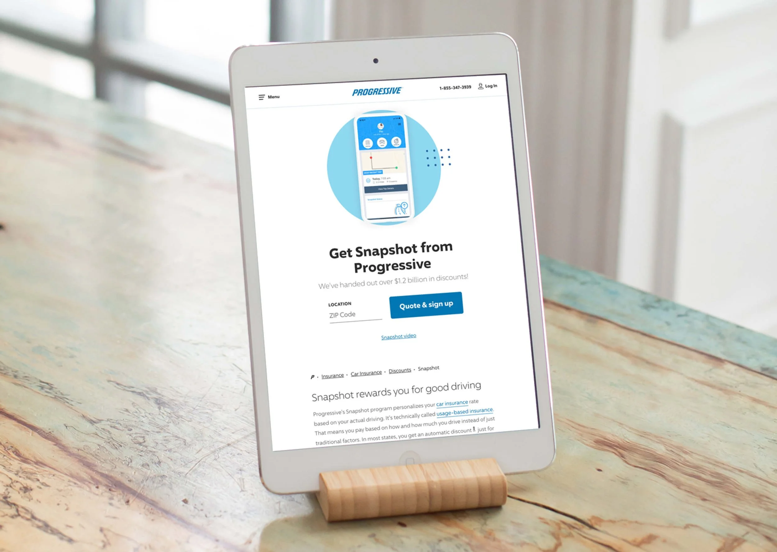
Car Insurance product page before and after redesign
Improving discoverability
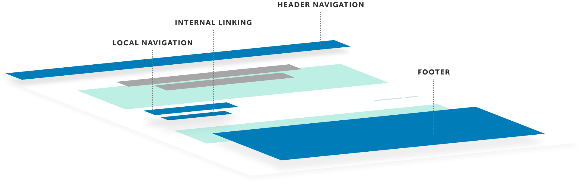
How users find and use our site, including those with accessibility needs. Determining the intent of a user entering Prog.com is essential to the success of our site. Whether they find us through organic, direct, or paid search, their journey should be productive, fluid, and effortless. Our goal was to improve site-wide navigation, enhance page performance, and evolve content strategy to make us more accessible as a whole.
Isolating key user flows across our site to include consistent and reusable page elements
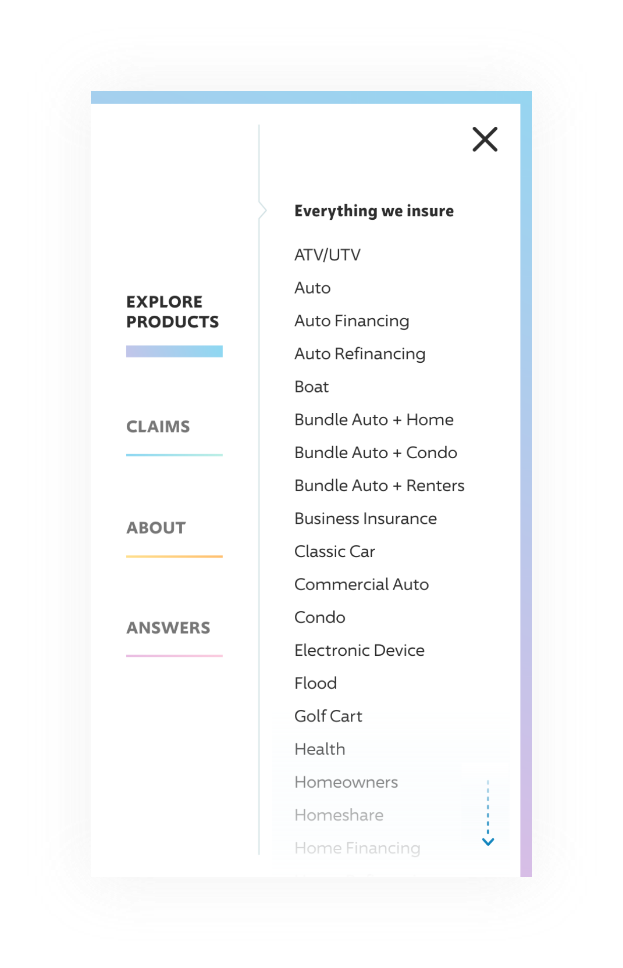
Reorganizing Our Products
Using a card sorting exercise and iterative testing, we were able to categorize and display our products in a more intuitive way for users.
Optimizing Content Structure
Enhancing our site structure allowed us to provide users with relevant and digestible experiences so they could easily locate the information they came to find.
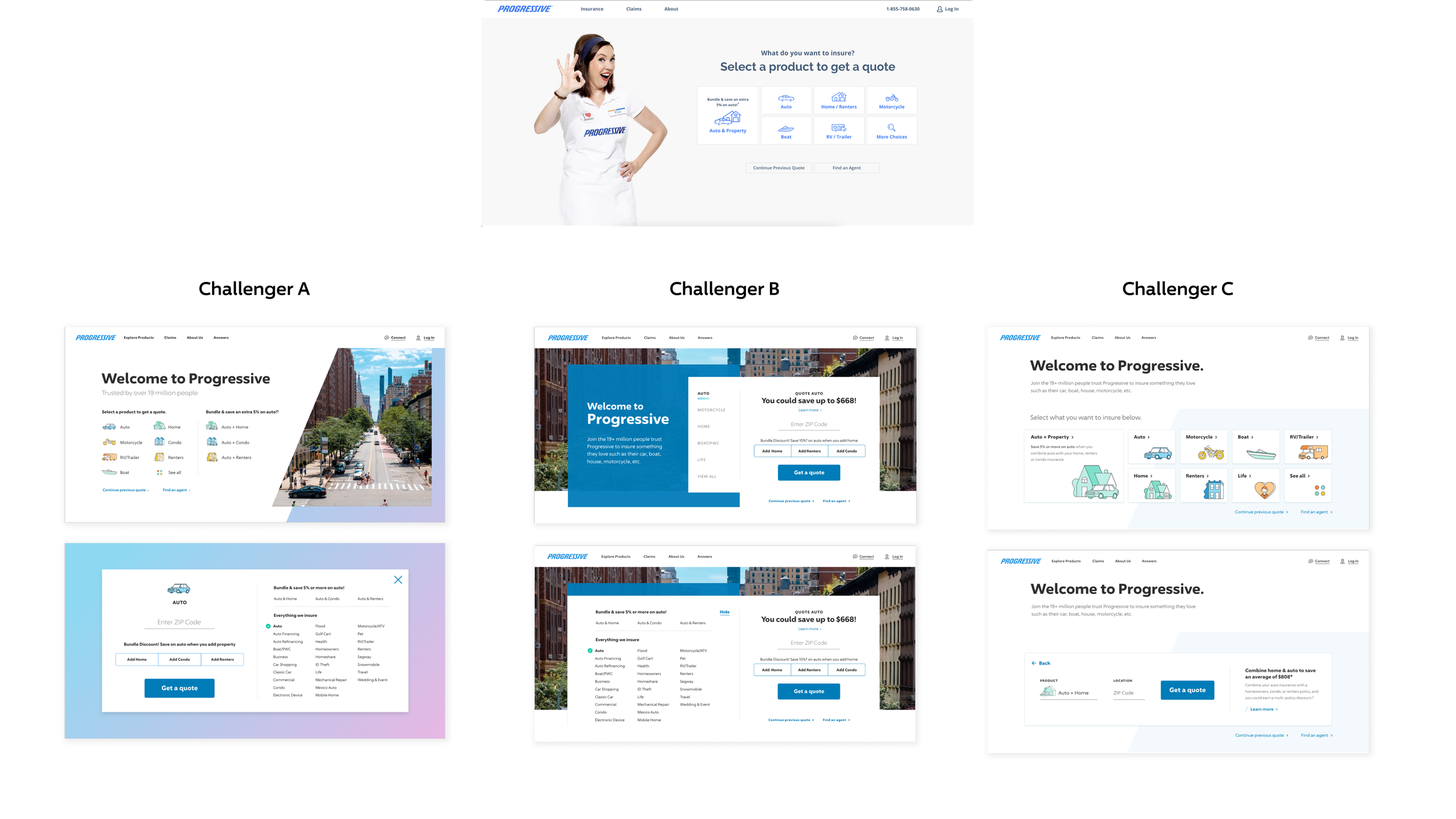
Desktop Navigation Concept Testing
Testing two challenger versions against control.
Most participants preferred Version A because it was easy to read.
They were easily able to find the information when prompted to perform a task.
Opportunities included removing the log in information from the top right and moving the close button there instead to align to user expectations.


Mobile Navigation Concept Testing
Overall Challenger A had the highest or nearly highest task completion when compared to others.
Control performed the lowest success rates on task completion, but appeared to be the preferred version when participants were prompted.


Final Design
The image above shows the final ‘go live’ version was challenger A for desktop and mobile.
Users appeared to have a hard time finding the close button on desktop, so we moved to the top right corner where most users expect it to be.
Content Strategy
As we redesigned the site, we focused on creating reusable modules for page templates for consistency and familiarity as users browsed the site. Below are some of the designs I contributed to the project.


Optimizing conversion
How users take action on our site, such as starting or purchasing a quote. To persuade a user to buy, their engagement with content and forms should be as seamless as possible. Preference and needs shift by device and channel, as we have found with adaptive homepage testing–further emphasizing the importance of isolating entry points to our site and delivering the most appropriate experience quickly.
Home page quote start usability testing
We started our approach into refining the quote start experience with isolating the home page ux, with three new challenger experiences proposed. Our main goals were to prioritize bundle quotes, showing as many products as possible, and testing drastically different experiences against control.
Key insights
Ultimately users were most successful at completing tasks on Challenger A. From here, we tested the new design against control in production, trying to understand it’s potential for quote start lift.

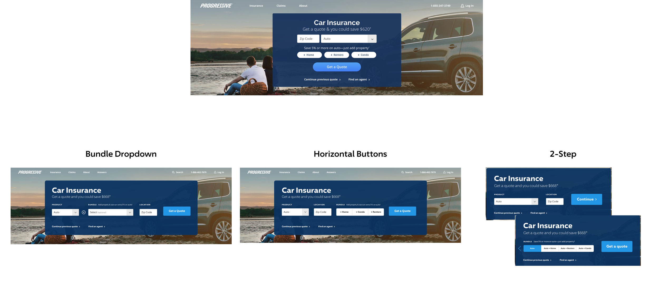
Auto page quote start production testing
Next, we wanted to isolate the ux of the auto page quote start, since Auto was the primary product users came to the site for. We set out to optimize the experience for bundle quotes (auto + home, auto + renters, or auto + condo), since those policies yield the highest return on investment, with the highest quality user segment that tends to not shop around as much. See results below:
Bundle Dropdown Version
+2.78% Desktop
+2.80% Mobile
Horizontal Buttons Version
+2.48% Desktop
+4.23% Mobile
2-Step Version
+2.09% Desktop
+3.37% Mobile
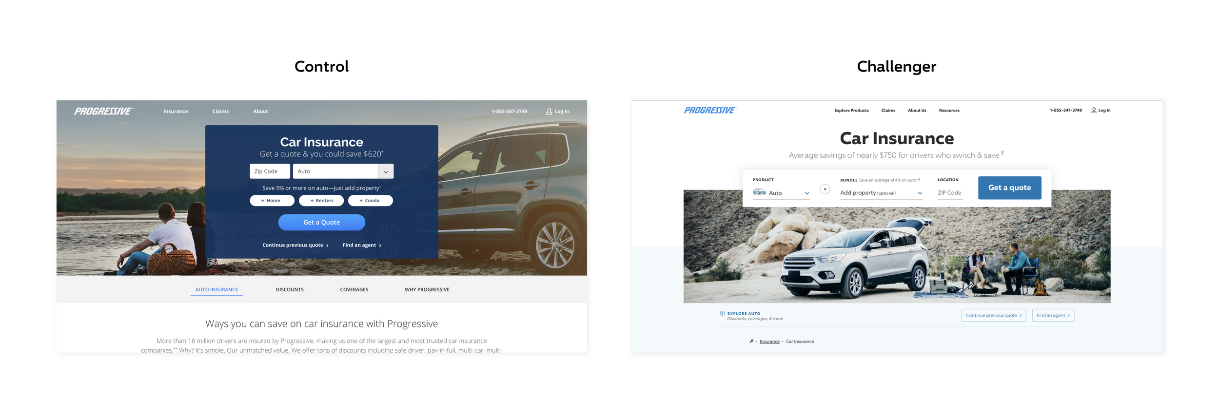
Auto Page Production Test
Next, we redesigned the auto page to accommodate the horizontal format of the quote start at the top of the page, and tested it against control with traffic split 50/50 between the two experiences.
Home Page Conversion
+1.58%
Auto Page Conversion
+3.79%
Global Nav + IA Organic Conversion
+1.44%
Overall Project Outcomes
Homepage (desktop)
20% Faster
Homepage (mobile)
51% Faster
Auto Page (desktop)
26% Faster
Auto Page (mobile)
65% Faster
Number of Pages on Site
351
Pages Overhauled
83
WCAG Compliance
98%
Page 1 Ranking Keywords
33K
Avg Daily Visitors