
Answering Insurance Questions
Progressive Answers is a self-serve content hub that simplifies the complex world of insurance. It provides clear, jargon-free answers to help users make confident insurance decisions—whether they’re shopping for policies, understanding coverage, or filing claims. The first version was released to help increase organic quote starts on Progressive.com, this version aimed to revisit and reduce friction points within the experience.
Role
Product Designer assisting concept design, user testing prep and content strategy.
Industry
Insurance
Type
B2C
Year
2022
Before redesigning, content was hard to navigate and had little categorization
Problem
The primary challenge faced was poor discoverability and navigation on the website, resulting in a high bounce rate of users arriving from Google to articles and promptly leaving. The homepage lacked effectiveness, and the absence of category pages further compounded the issue, hindering users' ability to explore and find relevant content

Key insights from user testing
Users tend to go back to their search engine instead of staying at insurer’s site to address new topics.
Users unaware of, but appreciate, Answers. An FAQ page was expected but the article library was not. Header navigation of “Answers” unclear on Progressive.com.
Opportunity to improve Search functionality on Progressive.com as well as within Answers to yield more accurate results.
Card sort study findings
50 topics with descriptions from Progressive Answers were provided for participants to organize into groups that make sense for finding the information in a redesigned site other than “By Product.”
By Product categories remained the dominant mental model. Of the 106 participants, 63% still categorized the cards this way.
Other categories included: Categorizing by Questions, How To’s, Tools, Education/Learning, General/Basic Info, Specific Info/Questions, Tools , or People/Family Related, Vehicle/Transportation Related, Home/Possessions Related, All Others
Original content categorization
Content strategy and wire-framing
Defining how to navigate Answers based on usability findings
Answers Homepage Version 1, Curated Journey
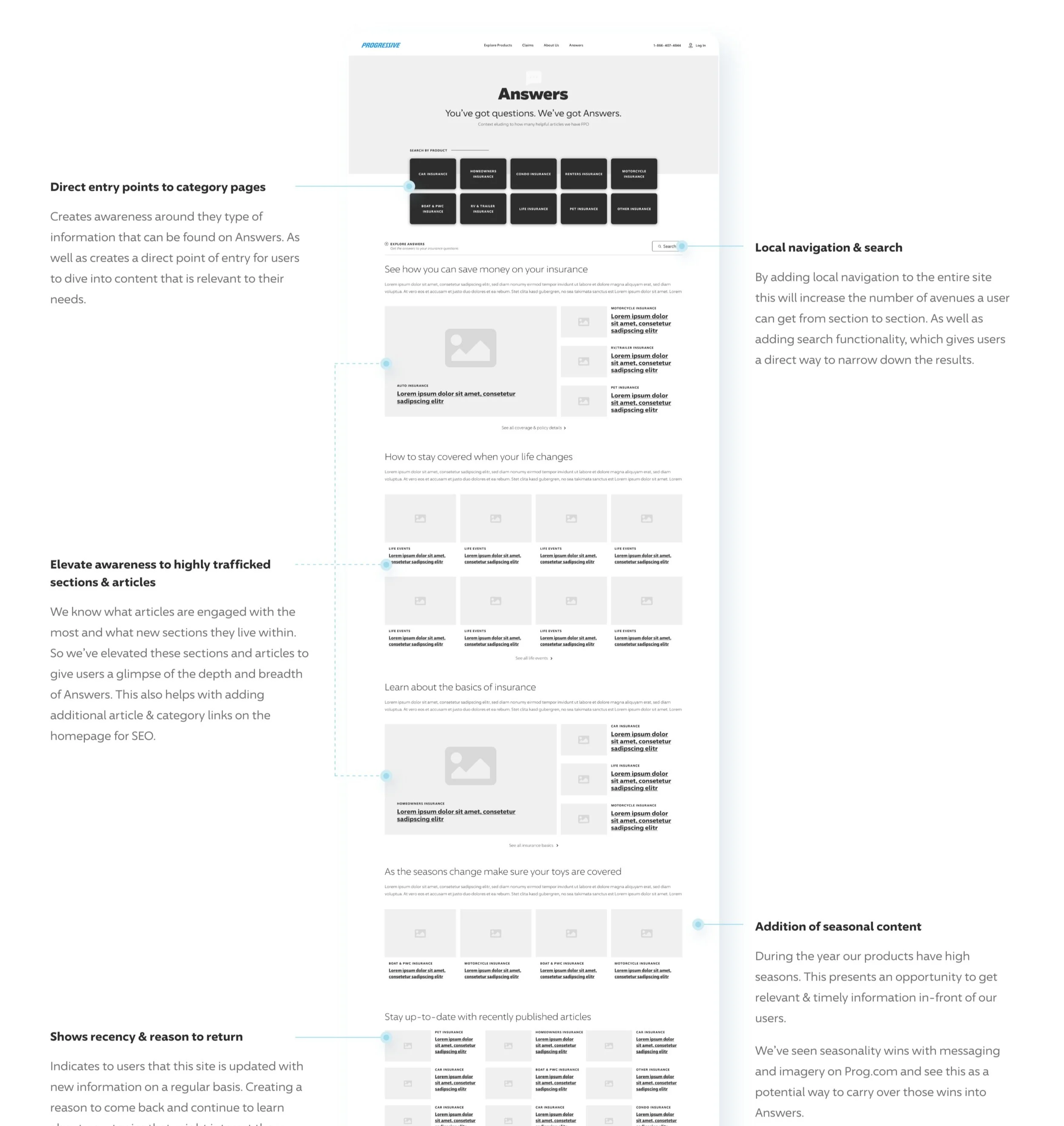
Here we promote the depth and breadth of Answers through a curated journey. This journey starts with broad categories and as a users scrolls down the page gets more refined in how the content is organized—setting the stage to the entire site structure.
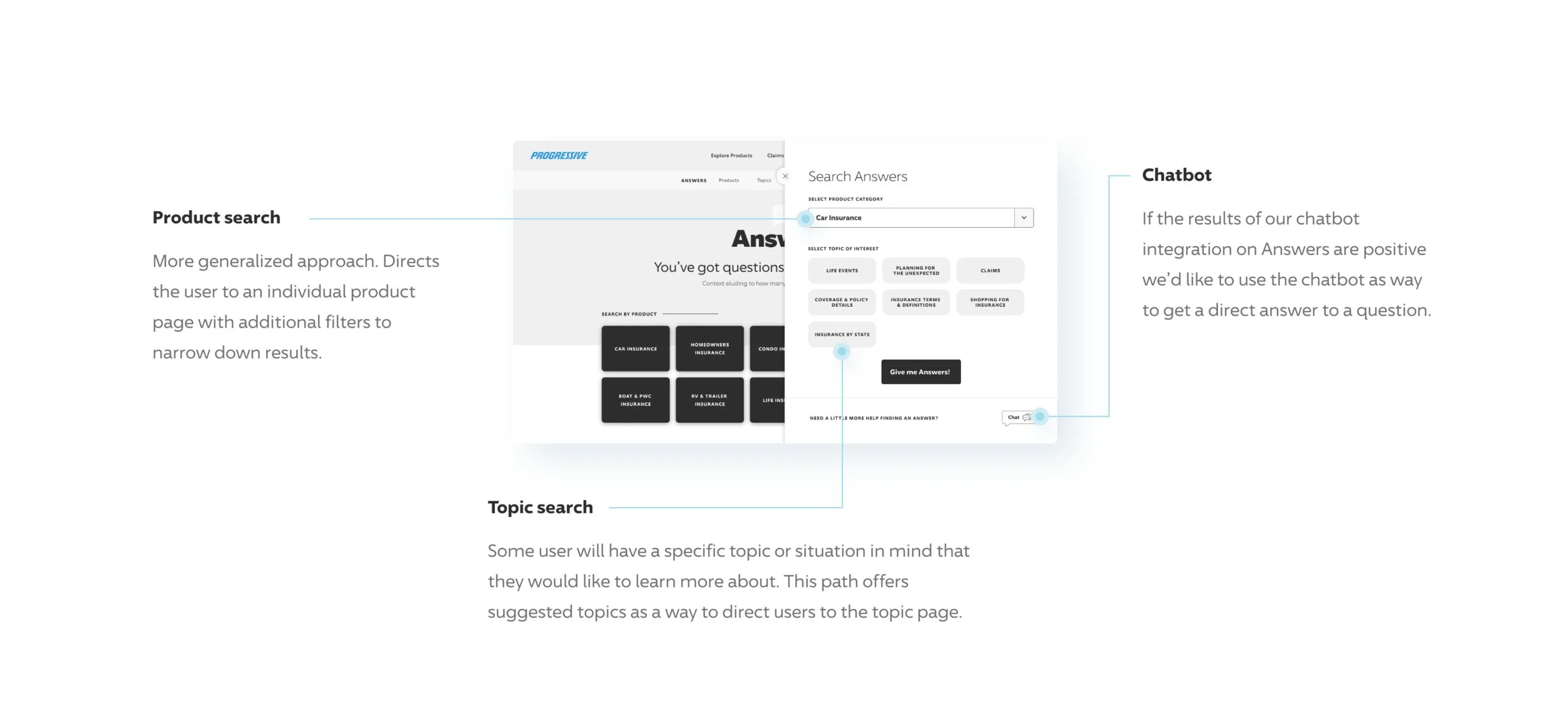
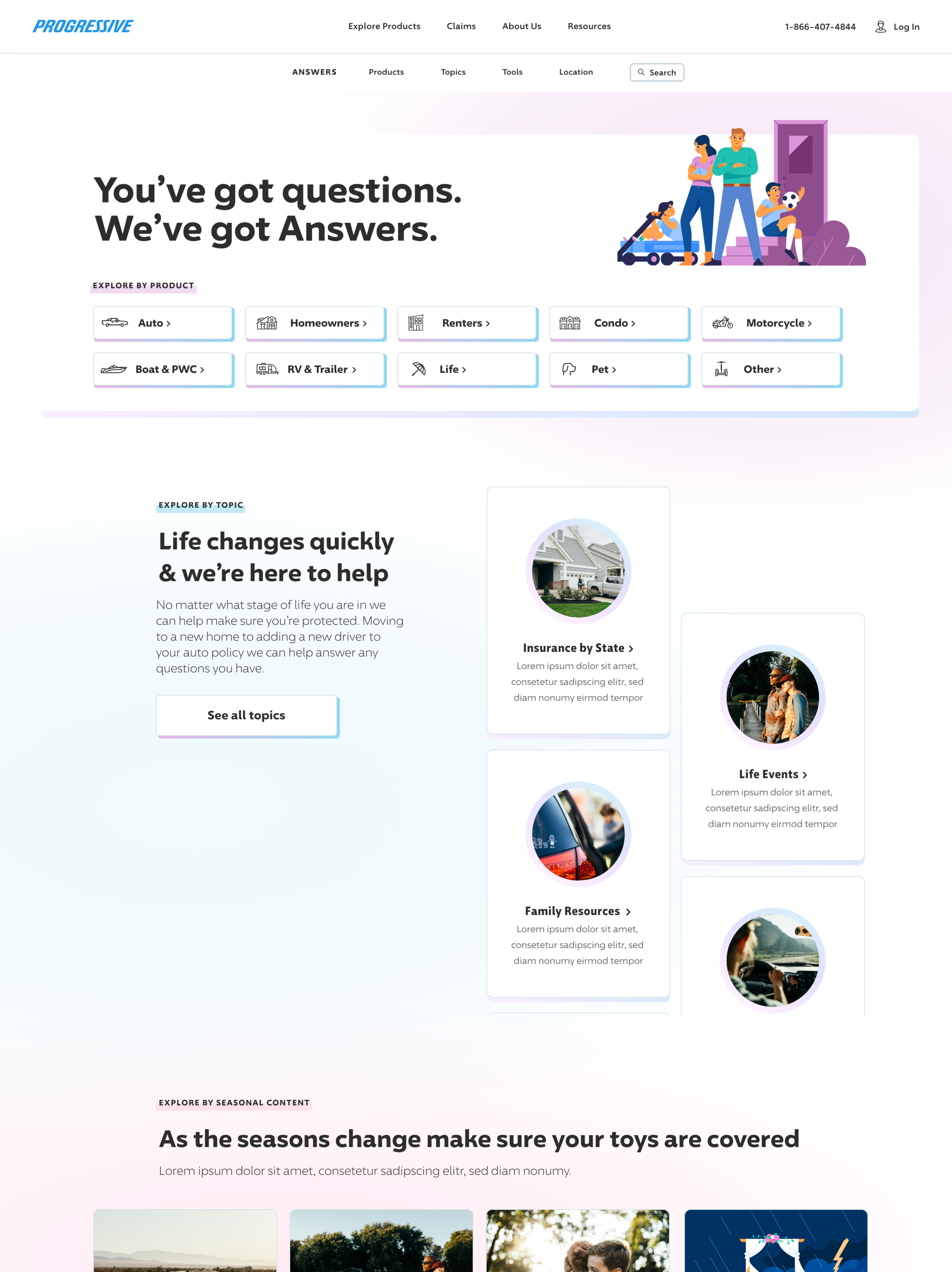
Answers Homepage Version 2, Path to Answers
This version aims to simplify the path to an answer by using products & topics as entry points. It relies on establishing a clear and distinct organization of content that will efficiently guide users deeper into the site where users will benefit from the additional functionality on those pages.
Version 1: Curated Journey Wireframe

Version 2: Path to Answers Wireframe
UI Design Concepts
Creating a unique identity within the overarching Progressive.com architecture
V1: Curated Journey
A familiar grid structure, type scale and modular approach that made the Progressive.com Redesign a success—but adding in branded Answers elements and trying a darker UI throughout gives this experience it’s own flavor while still feeling like part of the Progressive family.
V2 Path to Answers
Keeping the visuals light and airy create a sense of unity and familiarity between the two experiences. The colors maintain their bright and playful nature, keeping with the original essence of Answers.

V1 UI: Curated Journey
V2 UI: Path to Answers