
Reimagining Thrivent.com
TYPE
Responsive Web
ROLE
Lead Product designer
YEAR
2024-2025
COMPANY
Thrivent

Overview
Thrivent, a 100+ year old company evolving from life insurance to modern financial services, needed more than a visual refresh—it needed a shift in purpose. I led the strategy for the website redesign, aligning a new brand direction with a restructured information architecture to deliver a more intuitive, user-centered experience that drove stronger conversion outcomes.
Problem
Thrivent.com struggled with low conversion rates (0.80% baseline) due to poor user experience rooted in an information architecture based on business structure rather than user needs. Unclear navigation, inconsistent labeling, and complex paths to key content made it difficult for visitors to understand what Thrivent offers and how to take action. To support the company evolution, the site needed a user-centered IA that built trust quickly and made it easier for prospects to connect with an advisor.
Testing a hypothesis
We ran a design sprint to test the hypothesis that a simplified 5-page version of Thrivent.com, focused on key user needs like understanding the company, the advisor experience, and Thrivent’s unique value, would improve conversion rates by reducing friction and making the path to action clearer. We tested the microsite against the full 700+ page legacy site as a control.
In the 3-month test, the conversion rate rose from 0.80% to 1.80%.
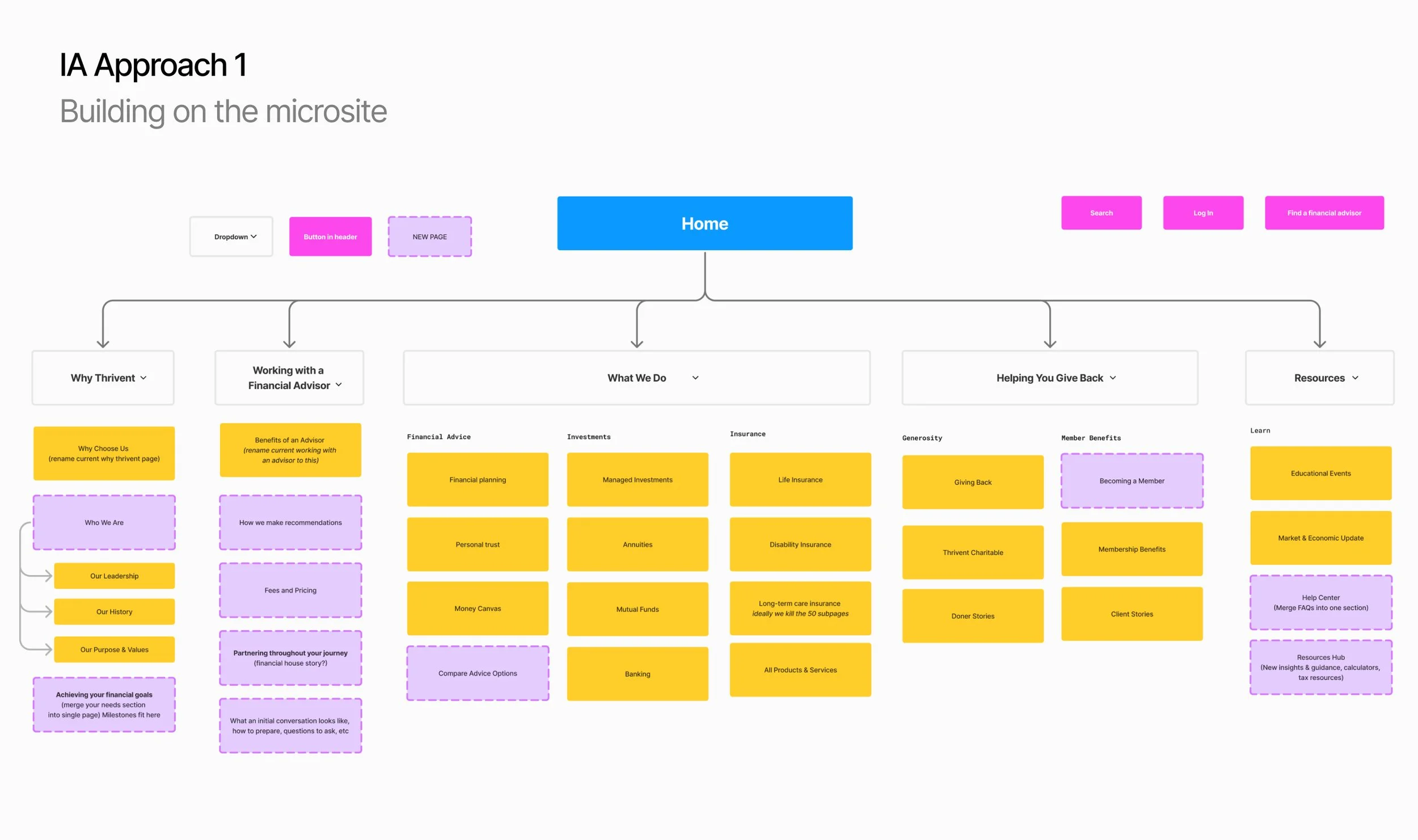
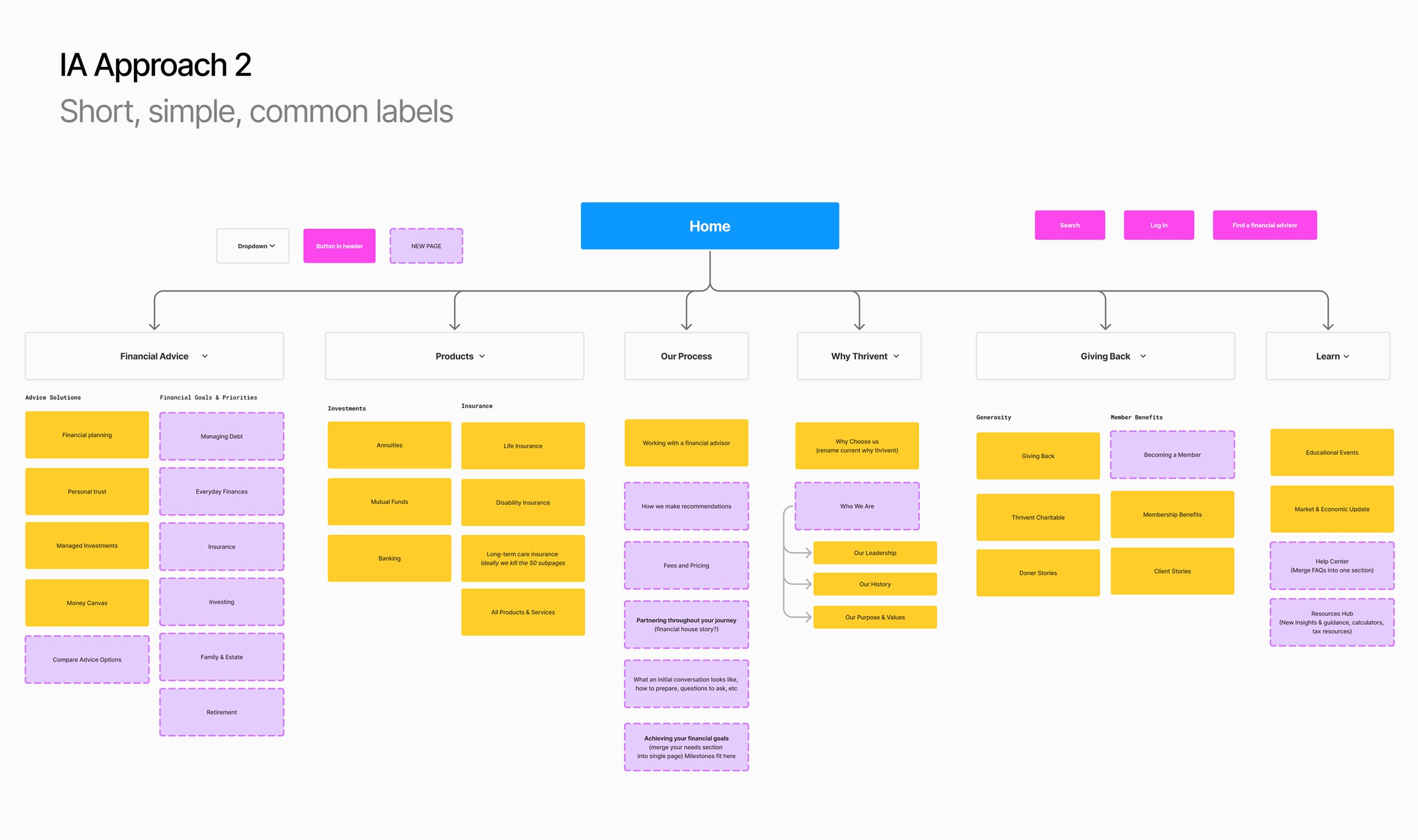

Card Sorting
Building on the microsite’s success, we restructured and tested two new approaches to Thrivent.com’s information architecture, each centered on core use cases and user needs. One used the microsite’s existing labels, while the other applied simpler, competitor-informed labels for broader clarity.
Key insights
The same three categories had the highest agreement in both Hybrid and Closed sorts: Products & Services, Giving Back, About Us. This shows users generally understand the recommendation structure.
Open card sorting gave category suggestions similar to those tested in other card sorts and recommended by design. This shows the original recommended structures match user expectations.
Users link Giving Back (card) and Thrivent Charitable closely to Giving Back category, while they view other parts as Why Thrivent, indicating users see this as a key differentiator for Thrivent.


Navigation concept testing
Next, we tested two new IA designs against the legacy structure to evaluate label clarity, navigation ease, task success, and how well each conveyed Thrivent’s story and purpose.
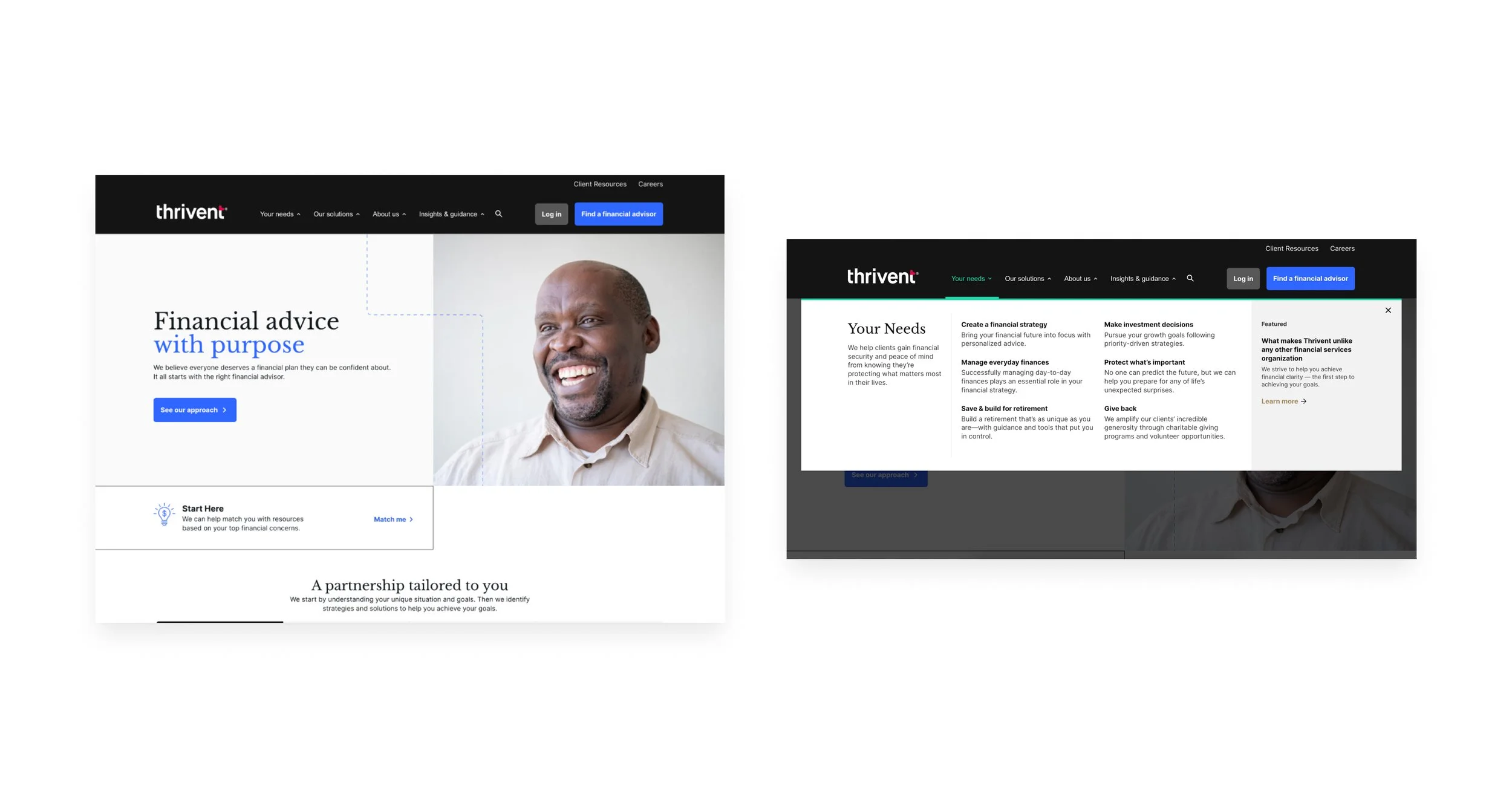
Version A: Modern Mega Menu
A refreshed take on a familiar pattern with clear hierarchy, improved scannability, and styling aligned to Thrivent’s updated brand.Version B: Simple Dropdown
A compact, intuitive menu using directional cues and color contrast to highlight key actions and improve usability.Version C: Legacy Control
The existing nav lacked clarity between links and text, used unclear labels, and felt visually outdated—leading to user confusion.

Prioritization
Partnering with product and engineering, we took a phased approach to rearchitecting the site. Guided by user journeys and business goals, we prioritized high-impact sections tied to conversion. This work was split across two product squads, enabling parallel progress and iterative delivery based on clear hypotheses and focus areas.


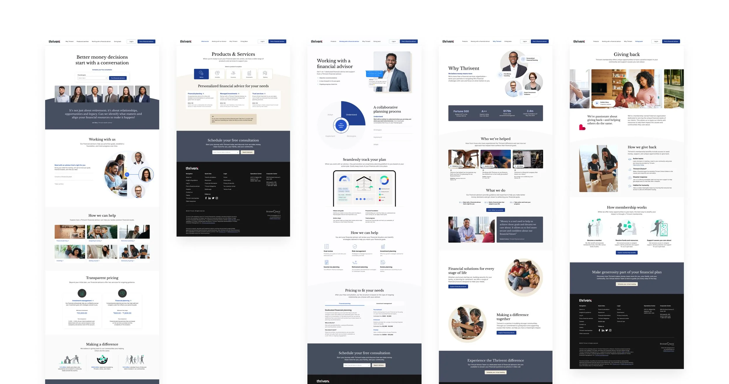
Phase 1 Releases
The Final Navigation + Footer which is visual representation of our new site IA, that presents Thrivent in a much more scannable and clear way. See the prototype of the navigation here.
Reimagined product page experience that reframes products through how advisors would sell them to you to support business shifts. These pages are also the first page template implemented on the website.
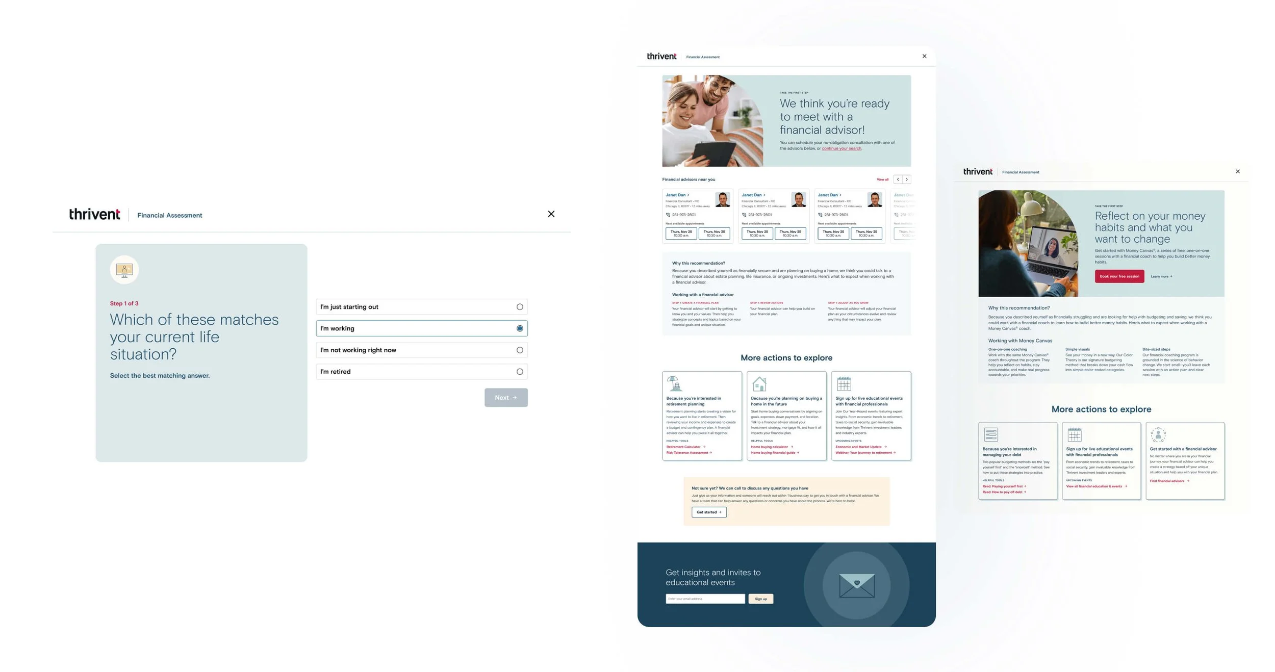
The MVP mini quiz, the Advisor Readiness Assessment, helps qualify leads by assessing income and assets to guide users toward either an advisor or our free money coaching program.