
UI Kits & Design Process
Creating reusable component libraries that are WCAG compliant and various process docs
Project Goal
Create a UI kit that includes various fields, toggles, banners and interaction elements that are compliant with WCAG standards and can be repurposed on an enterprise level at Progressive.
Responsibilities
Lead designer, working with design managers for feedback. Additionally working cross-functionally and sharing with the Marketing and CRM group.
Direct quoting kit
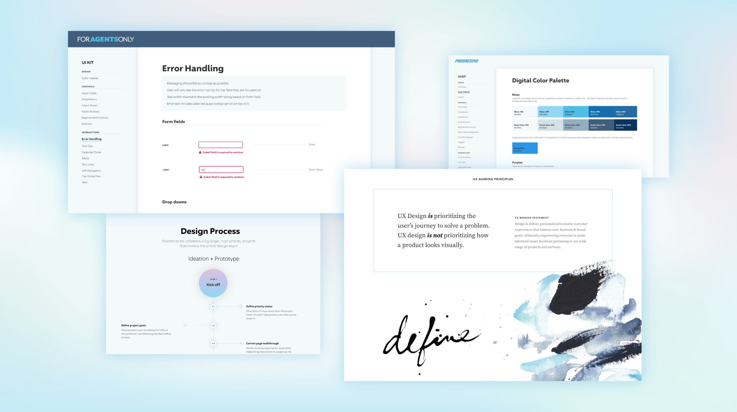
Creating a kit for our customer facing platforms
Design with WCAG accessibility guidelines and brand guidelines in mind.
Determine how to translate Progressive’s core colors to more digital friendly look.
Ensure all variants and component states are considered and documented.
View the prototype here.
Agency quoting kit
Insurance agents use a slightly different platform to quote
Agents use a different quoting platform to get customers a quote, and since they are power users, some of the UX and UI elements make sense to be different. For example, help text isn’t as necessary, they can quote you multiple products at once, etc.
The goals for this UI kit remain the same as the direct quoting kit.
View the prototype here.

UX Guiding Principles
In early 2021, the team used our newly updated design principles as a fun exercise to play around with layouts that break the Progressive brand constraints.
The image to the left showcases some abstract paintings I did to pair with each principle, where they go from chaotic and unorganized, to clearly defined, and then starting to blend and make sense.
UX Design Process
Another part of 2021 initiatives included ironing out the process for how our team works amongst ourselves to hold us accountable.
The image to the right shows the step by step process my coworker and I worked through to try to articulate and visualize the process for the rest of the team.
