
The New Progressive.com
The #1 insurance site — now smarter, faster, & more intuitive in every way.
Project Goals
To improve discoverability, conversion, and consistency throughout Progressive.com focusing on accessibility, brand standards, and UX/UI optimization.
Responsibilities
Designer working with lead designer and broader team to determine key ares of focus to take to usability through moderated and unmoderated studies, then iterating upon learnings to test in production against control.

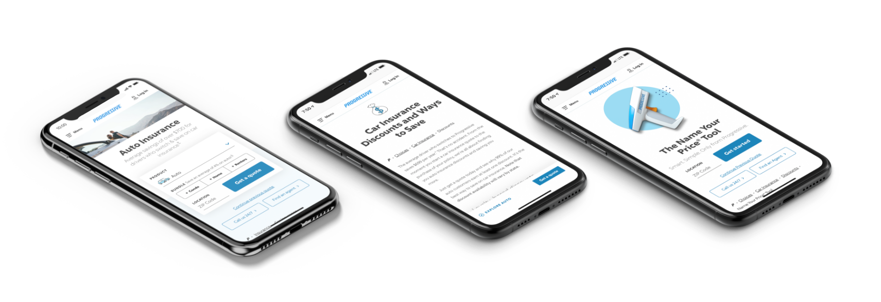
Improving discoverability
How users find and use our site, including those with accessibility needs
Determining the intent of a user entering Prog.com is essential to the success of our site. Whether they find us through organic, direct, or paid search, their journey should be productive, fluid, and effortless. Our goal was to improve site-wide navigation, enhance page performance, and evolve content strategy to make us more accessible as a whole.
Global navigation
Improving usability of key navigational elements
Header Navigation
Provides an all-access path to the main areas of our site for users who know specifically where they want to go.
Local Navigation
Offers a path to related content for users who want to dive further into a section.
Internal Linking
Utilizing more links within our content so users can navigate to different pages that can provide additional information.
Footer
Acts as a secondary navigation element that’s consistent on every page and provides an avenue to the most popular links on our site.

Header Navigation Usability Study Goals
Understand user reactions to 2 redesigned versions of the global navigation against control.
Learn whether users know how to interact with the navigation and know where to go.
Desktop Results
Most participants preferred Version A because it was easy to read.
Most participants were able to find the information when prompted to perform a task.


Mobile Results
Overall Challenger A had the highest or nearly highest task completion when compared to others, and was the intended mobile version of the winner from desktop.
Control performed the lowest success rates on task completion, but appeared to be the preferred version when participants were prompted.


Final header navigation
The final ‘go live’ version was challenger A for desktop and mobile.
Users appeared to have a hard time finding the close button on desktop, so we moved to the top right corner where most users expect it to be.


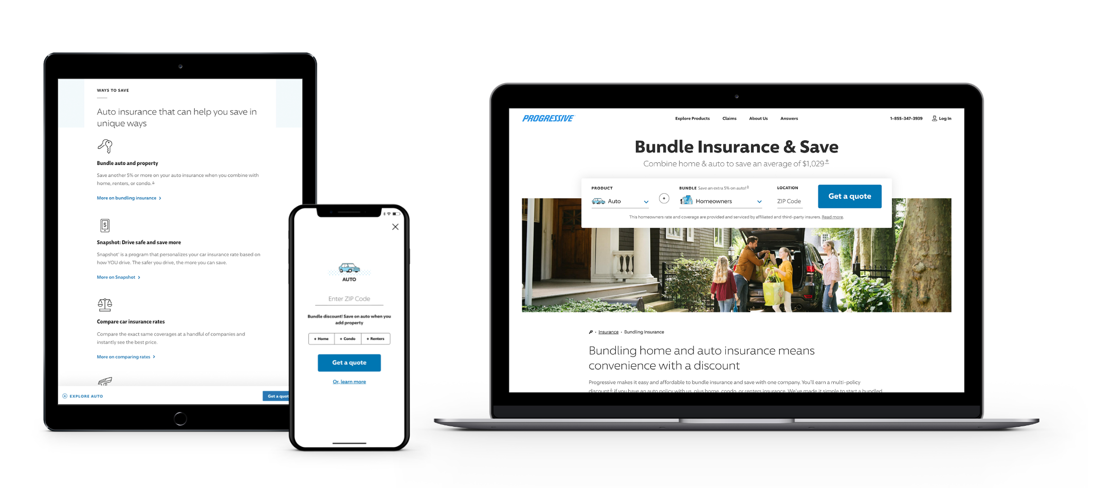
User journey
Isolating key user flows across our site to include consistent and reusable page elements
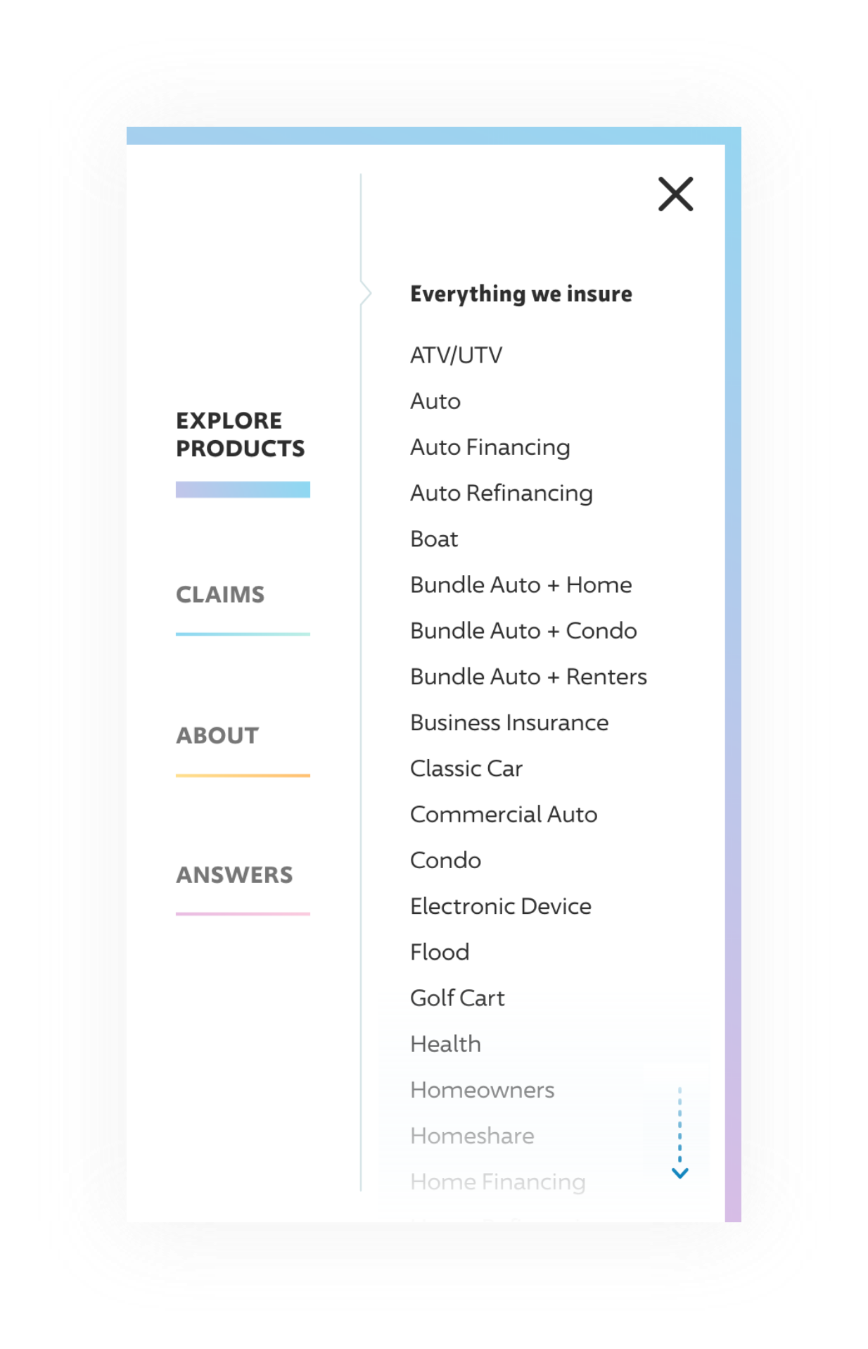
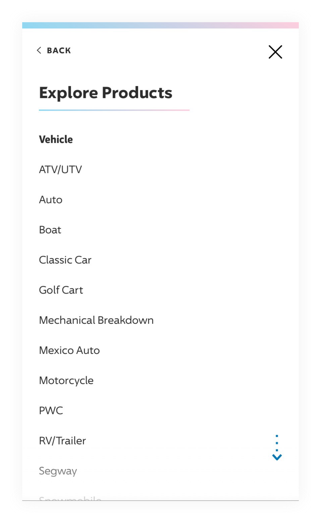
Reorganizing Our Products
Using a card sorting exercise and iterative testing, we were able to categorize and display our products in a more intuitive way for users.
Optimizing Content Structure
Enhancing our site structure allowed us to provide users with relevant and digestible experiences so they could easily locate the information they came to find.
Some examples of reusable modules I contributed to the project


Optimizing conversion
How users take action on our site, such as starting or purchasing a quote
To persuade a user to buy, their engagement with content and forms should be as seamless as possible. Preference and needs shift by device and channel, as we have found with adaptive homepage testing–further emphasizing the importance of isolating entry points to our site and delivering the most appropriate experience quickly.
Brand consistency
How users recognize and identify our site
Uniting our brand behind a single visual language that is undeniably Progressive. Using new colors, illustrations, and a custom typeface help us align to our brand essence and be more inclusive and approachable to our users. Here’s how it came to life.

New color palettes and fonts that embrace our brand
We changed our color scheme to improve contrast, making our content easier to see for all users, especially those with low vision. Utilizing our primary color palette of Progressive blue and white with modern and muted tones that create a calm, lighthearted feel. A broader spectrum is used in illustrations throughout the site for pops of additional color.

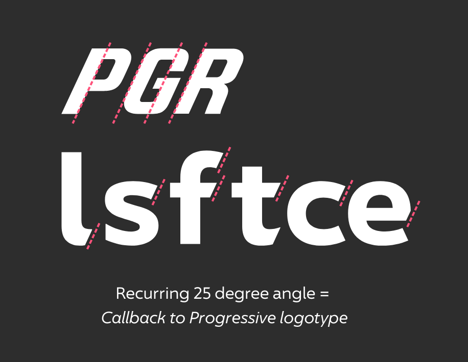
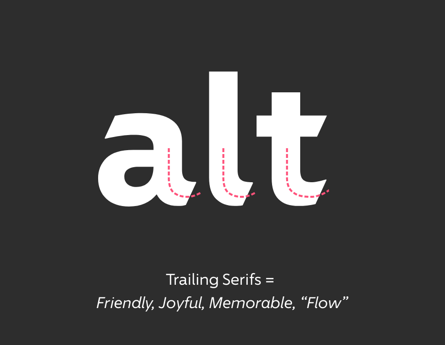
Introducing our new custom typeface, 96 Sans
Working with Monotype, we created a custom typeface that gives us a way to tie the look, tone, and feel of our brand identity into a recognizable element that we use on all points in the customer journey. It’s ownable, consistent, and helps promote brand exposure.


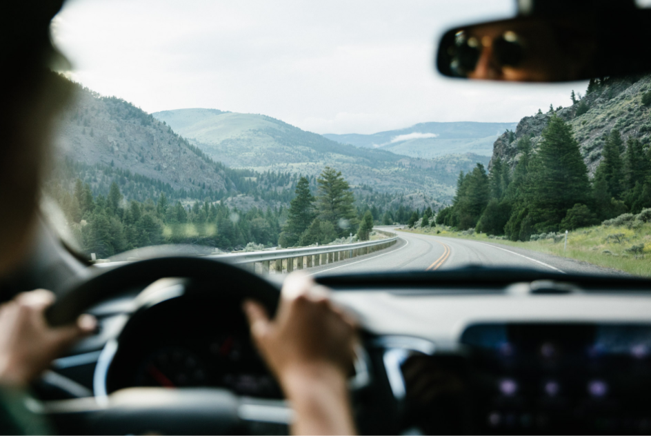
Using new photography, illustrations, and iconography, we embraced a style that captures the spirit of our brand and feels more relatable.
Product Icons
Utility and discount icons

Vibrant, product page illustrations


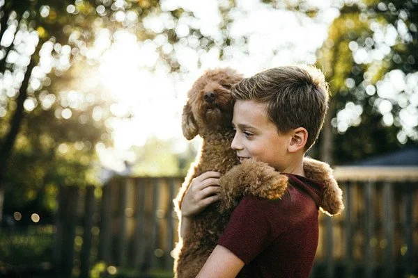
Candid, warm, and natural product photography

Project Outcomes
Simplified code. Faster load speeds.
We took a deep dive into the framework of our site and identified opportunities where smarter code would improve load speeds and performance.The faster a page loads, the better the overall experience is for the user. Optimized content and assets is found faster and ranked higher by search engines.
Homepage (desktop)
20% Faster
Homepage (mobile)
51% Faster
Auto Page (desktop)
26% Faster
Auto Page (mobile)
65% Faster


